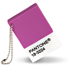
Those involved in the design and graphics world will have heard that Pantone has announced the 2014 Colour of the Year….and it’s purple!
It’s official name is 18-3224 Radiant Orchid, and is described as “an enchanting harmony of fuchsia, purple and pink undertones, Radiant Orchid inspires confidence and emanates great joy, love and health. It is a captivating purple, one that draws you in with its beguiling charm”!
And if you are wondering, this is what it looks like….
I wondered how Pantone choses their Colour of the Year and found this quote in their press release:
“The color of the year selection requires careful consideration and, to arrive at the selection, Pantone quite literally combs the world looking for color influences. This can include the entertainment industry and films that are in production, traveling art collections, hot new artists, popular travel destinations and other socio-economic conditions. Influences may also stem from technology, availability of new textures and effects that impact color, and even upcoming sports events that capture worldwide attention.”
Even after reading that, how on earth do they end up chosing a colour…and not only a colour but a particular shade of that colour! And this is for the year ahead, not what already has been the colour “trend”!
But I am not a fan of the “Colour of 2014″…apparently I am still stuck in 2009!
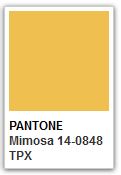
This is because my favourite colour is yellow…and the colour of that year was 14-0848 Mimosa..a colour which is described as “a warm, cheerful shade that sparks imagination and innovation and expressing hope and reassurance”
And that sounds just right to me!
But I have to admit that I never used to like yellow..I had a good reason…my husband was a sickly shade of yellow for many years due to severed jaundice caused by an autoimmune disease that eventually required him to have a lifesaving liver transplant. When he was really sick, the whites of his eyes were like egg yolks!
Yellow was definitely wasn’t “cheerful”, and certainly didn’t give much “reassurance”! Yellow meant being very sick…..
But now he is back to a very much more healthy shade, and I discovered that I actually do love yellow!
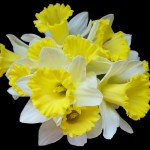
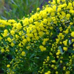
For example, I have a gorgeous yellow leather bag that I LOVE!…..my oh so comfortable yellow LoPros from Crocs…..yellow candleholders….and love yellow flowers such as daffodils, and the golden wattle…the list goes on…I even have a yellow watering can!
Even though yellow is “so 2009”, I am still loving it!
Do you have a favourite colour? Or do you follow colour trends over time?


